Introduction
Back in March the VW Passat was awarded the 2015 European Car of the Year prize - a deserving, if dull, choice.
I thought I’d have a look at the voting in the competition to see if there were any patterns to be spotted. The full results from 2002 to 2015 are available on the Car of the Year site.
Here are two things I found…
Pattern 1 - Do national juries give higher votes to their own home-grown car brands?
In a word - YES!
The graph below shows only countries which have their own native car brands. The dots represent how local jury members from each of these countries voted for their local brands.
- Each dot represents a jury member’s vote for one car.
- The horizontal placement of the dot represents how the vote differed from the overall result for a car. For example, if a car received an overall score of 8 but a jury member only awarded 5, the dot is placed at minus 3 showing the difference from the overall.
- Boxplots are used to summarise the groupings of jury member votes for each country. In this plot the boxes show the range of the middle half of the votes (i.e. those contained in the 2nd and 3rd quartiles.).
France and Germany have by far the greatest number of vote dots as they have large numbers of both cars and judges in the competition.
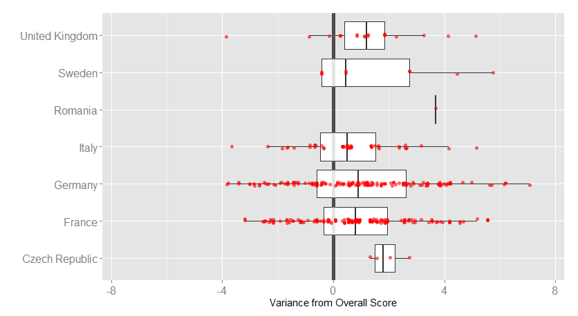
What this shows is that, on average, all country juries give cars from their home-grown brands better marks than the overall result (votes from all countries).
This type of behaviour can perhaps be expected. It’s reasonable to assume that car makers will design cars that suit their own people first and foremost. So when motoring journalists test these cars, that have been designed largely for them, it is likely that they will be well disposed towards them.
…or maybe they just like to see the home team win!
Pattern 2 - How do specific countries vote for brands from different countries?
There isn’t enough space here to show graphs for each country so I’ll start with my home country of Ireland, and then look at the four large car producers in Europe.
Here are the results for Ireland…
(Remember this shows how scores from Irish jury members differ from the overall scores.)
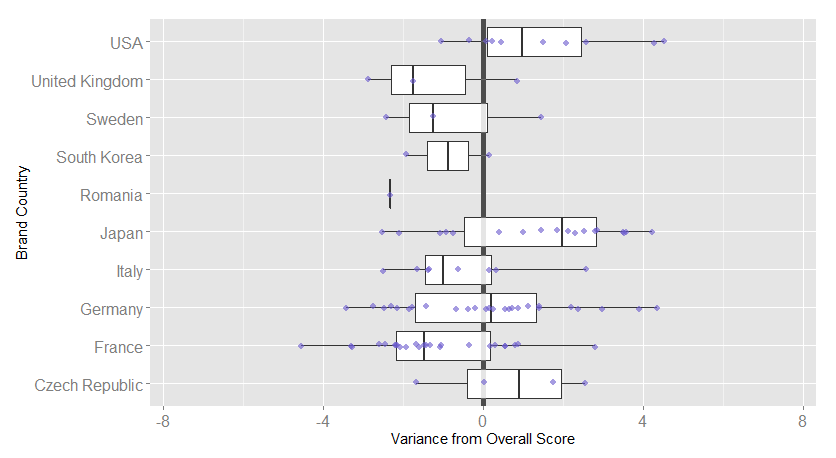
This shows that Ireland is better disposed to car brands from the USA (mostly Ford in this dataset), Japan and the Czech Republic (all Skoda).
It also shows that there appears to be a bias against French cars in Ireland. The line in the centre of the French boxplot shows that the median Irish vote is 1.5 less than the Europe-wide overall score.
…and how about the four powerhouses of car brands in Europe? (France, Germany, Italy & UK)
This is a slightly monstrous chart but if you followed the earlier ones it should be understandable. It shows how jury members from these 4 countries voted for the car brands of various countries.
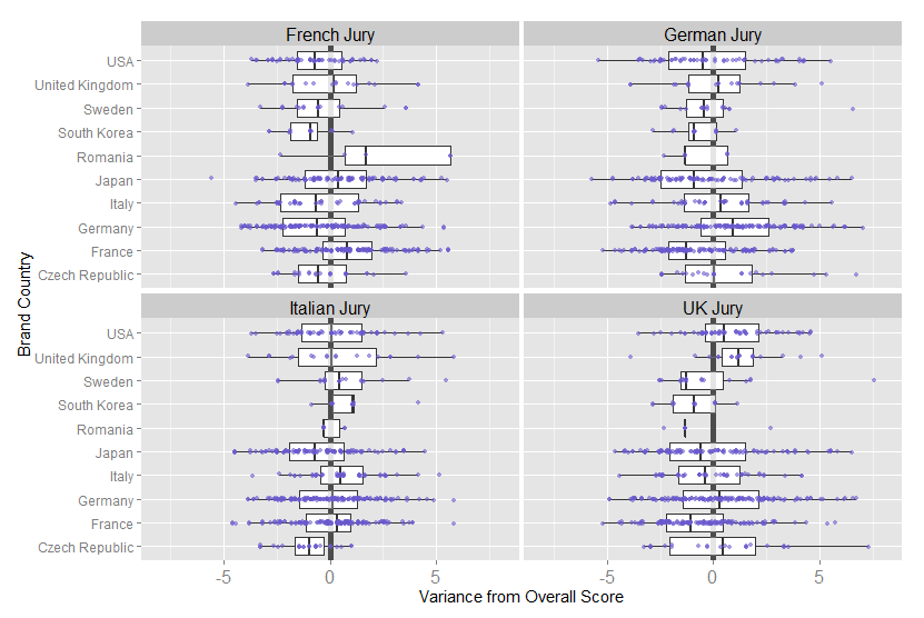
Some things to note from this:-
- Looking at the votes from Germany and France, each of them on average, gives lower votes to each other’s cars. Italy and the UK don’t appear to be affected in quite the same way.
- All of the countries give Japanese brands lower scores than the overall score, with the exception of France.
- Three of the countries give US brands (almost entirely Ford in this dataset) lower scores. The UK is the exception; Ford has always had a large manufacturing base there which may impact this result.
- While the data for Romanian brands is sparse, France does appear to be very well disposed to their cars. But this is less of a surprise when we find that all of these votes relate to Dacia, a brand that is wholly owned by France’s Renault.
Data Source: The official website of the European Car of the Year.
If you’re interested, check out the data and technical details.